Designing the Perfect Input Field
Research
I joined a team at the early stages of establishing a Design System and the first component I designed was the Input Field. This was a new challenge for me so I began research with Material Design documentation.
I wanted to see what made their input field so good and widely used based on the design of the component. I found research they did in 2017 when they redesigned their input field.
Two styles: Outlined and Filled
From this I learned
Input Fields with a visible Bounding Box are best for users to recognize the component as a clickable object
The Transform Label goes from 16px to 12px once the Input Field is selected
I preferred outlined Input Fields to filled Input Fields when using multiple instances on a single page
I took these points and wanted to see what other experts in the field were saying about Input Fields, specifically the use of placeholder text in Input Fields, so I found this research from the Nielson Norman Group that describes their idea of an ideal Input Field.
From this I learned that placeholders in Input Fields are not the best solution for presenting information to the user.
Placeholders can be perceived as fields that are already filled in (especially in the Material Design example)
Placeholders require the user to remember what was there when they begin typing and their input replaces the placeholder information
In the above example, the Input Field also has a minimum horizontal size it can be since there is a short phrase inside the input field
After researching from Google’s Material Design and from the Nielson Norman Group, I wanted to see what the “average” designer was writing about Input Fields so I turned to Medium and found this article about the anatomy and use of their version of an ideal Input Field.
This reinforced my thoughts on a static, vertically-stacked Label
Static, vertically-stacked Label can be quickly scanned (based on eye tracking research referenced in the original article)
The relationship between label and field is immediately apparent
Static and vertically stacked Label leaves the input field blank showing to the user that the area is inter-actable, when not using placeholder text
This article also highlighted the importance of inline validation so the user can know exactly where they have an error or more information is required, which further reinforces the usage of the assistive text field.
Presentation
I presented this research to the UX Team along with a first draft of the Input Field that fit this research.
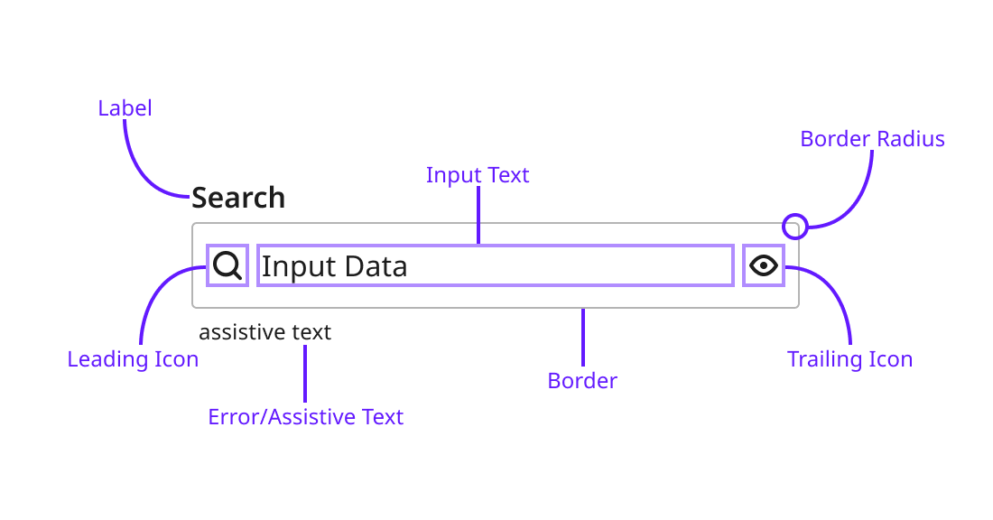
It broke down to a component with 3 sections
Label section had a Primary and Secondary Label. The majority of use cases will just utilize the Primary Label, with the Secondary Label available when the user needs additional information needed to fill out the field.
The Input Field section is pretty straight-forward, this is where the user inputs text. Providing support for both a Leading and Trailing Icon allows this component to be implemented in even more use cases.
Error/Contextual Info section is essential for error states, or small tags like a “required” text.
With these three sections’ usage planned out, the research behind it, and the UX Team’s approval, I could get started on building the component in Figma.
Implementation
This isn’t meant to be an instructional article on how to use Figma so I’ll go over the finished components and how it could be easily customized by the UX Team I worked with.
Because I knew there were going to be multiple States (Resting, Focused, Disabled, Error) for these Input Fields, I decided it would be easiest to create two base components that could then be copied for each State. That way if I needed to come in and make a change to a text style or we wanted rounder corners on the input field I would only need to change it here and those would be propagated to all the States.
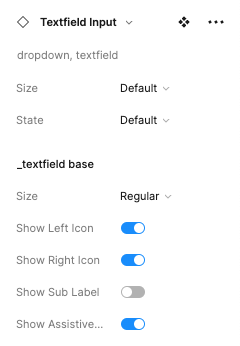
Using Auto Layout in Figma, designers just needed to take an instance of the component and resize to fit their design without worrying about spacing or padding of the component.
For those really interested in the finer details of how this component was built here are the Layers and Properties panels for an instance of the Input Field Component.
Final Component
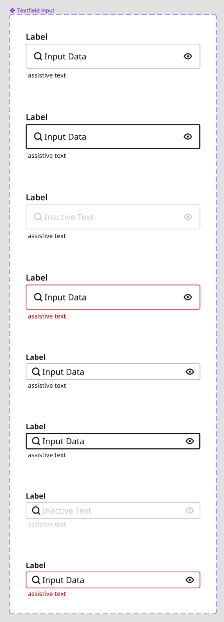
4 States, 2 Sizes
With the customizability of the base unit I was able to create just eight components variations that covered all of the use cases that the UX Team were currently using
Conclusion
Establishing a Design System has a large set of challenges, but also a large amount of research in their usage and implementation. Researching, testing, presenting and designing the Input Field was a hugely satisfying job. I got to learn how these base components are researched, conduct my own tests, and work with my fellow designers in how we see this component being implemented.
The biggest take aways from this work was
Vertically stacked input fields with a fixed size and placement label is the easiest and fastest layout for users to scan and fill out
A clear bounding box provides the affordance users need to recognize an element they can interact with
Auto Layout is a designers best friend when making flexible components
Using a “base component” in Figma allows for fewer variations and retains the flexibility of a usable component


